
KBH Group
KBH Group
KBH Group
Powered by our community
Powered by our community
Powered by our community
TYPE
TYPE
TYPE
Professional
Professional
Professional
Year
YEAR
Year
2024
2024
2024
INDUSTRY
INDUSTRY
INDUSTRY
Industrial
Industrial
Industrial
ROLE
ROLE
ROLE
Brand Identity, Brand Architecture, Brand Guidelines, UX & UI Design, Print, Environmental
Brand Identity, Brand Architecture, Brand Guidelines, UX & UI Design, Print, Environmental
Brand Identity, Brand Architecture, Brand Guidelines, UX & UI Design, Print, Environmental
Advancing global networks of industrial sourcing and supply
Advancing global networks of industrial sourcing and supply
Advancing global networks of industrial sourcing and supply
discover more
discover more
discover more


A mark of strength, precision, and KBH’s evolving ambition
A mark of strength, precision, and KBH’s evolving ambition
A mark of strength, precision, and KBH’s evolving ambition
discover more
discover more
discover more


The creative direction combines a confident visual system with purposeful typography and a refined colour palette.
A cohesive visual language shaped through confident typography, a refined color palette, and a flexible identity system designed to modernise the brand while staying true to its roots.
The creative direction combines a confident visual system with purposeful typography and a refined colour palette.
A cohesive visual language shaped through confident typography, a refined colour palette, and a flexible identity system designed to modernize the brand while staying true to its roots.
The creative direction combines a confident visual system with purposeful typography and a refined colour palette.
A cohesive visual language shaped through confident typography, a refined colour palette, and a flexible identity system designed to modernize the brand while staying true to its roots.
The creative direction combines a confident visual system with purposeful typography and a refined colour palette.
A cohesive visual language shaped through confident typography, a refined colour palette, and a flexible identity system designed to modernize the brand while staying true to its roots.
creative DIRECTION
creative DIRECTION
creative DIRECTION
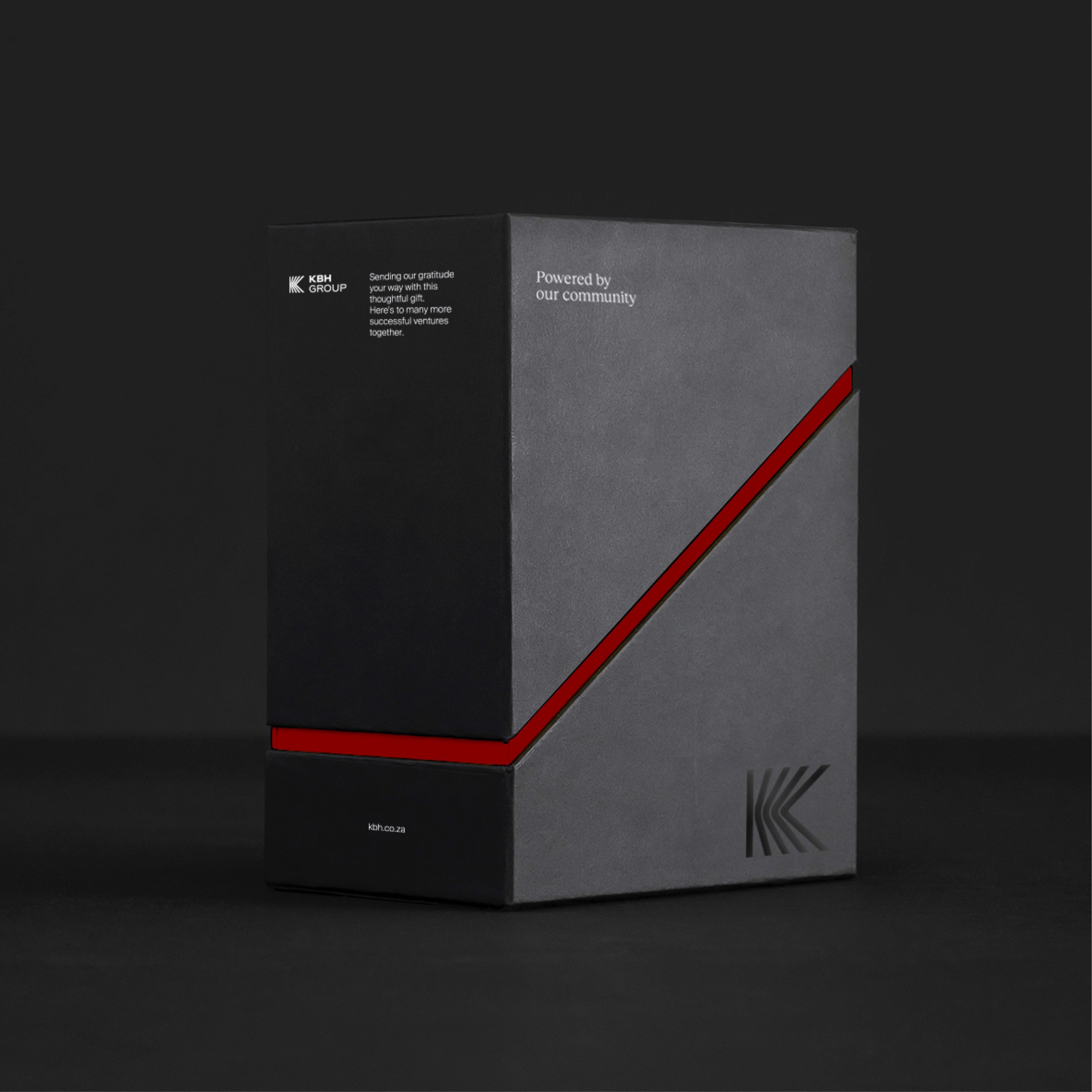


Designed to move as seamlessly as the business behind it
Designed to move as seamlessly as the business behind it
Designed to move as seamlessly as the business behind it
discover more
discover more
discover more
One parent. Five distinct identities.
Following the parent brand, five subsidiary companies were rebranded under a unified system. Each received its own colour palette and visual personality while retaining the core principles of the KBH identity. The challenge was finding the balance between individuality and cohesion across the group.
One parent. Five distinct identities.
Following the parent brand, five subsidiary companies were rebranded under a unified system. Each received its own colour palette and visual personality while retaining the core principles of the KBH identity. The challenge was finding the balance between individuality and cohesion across the group.
BRAND ARCHITECTURE
BRAND ARCHITECTURE
BRAND ARCHITECTURE



outcome
outcome
outcome
The new system brought clarity and cohesion to a complex, multi-layered organization. KBH now operates with a unified visual language across its parent company, nine verticals, and five subsidiary brands creating consistency without limiting individuality. The refreshed identity strengthens recognition across global markets while supporting the company’s next phase of expansion. From print to digital to environmental applications, every touchpoint now feels connected, intentional, and built for scale.
The new system brought clarity and cohesion to a complex, multi-layered organization. KBH now operates with a unified visual language across its parent company, nine verticals, and five subsidiary brands creating consistency without limiting individuality. The refreshed identity strengthens recognition across global markets while supporting the company’s next phase of expansion. From print to digital to environmental applications, every touchpoint now feels connected, intentional, and built for scale.
The new system brought clarity and cohesion to a complex, multi-layered organization. KBH now operates with a unified visual language across its parent company, nine verticals, and five subsidiary brands creating consistency without limiting individuality. The refreshed identity strengthens recognition across global markets while supporting the company’s next phase of expansion. From print to digital to environmental applications, every touchpoint now feels connected, intentional, and built for scale.
learnings
learnings
learnings
Translating the system into real-world applications proved complex, especially within such a technical and industrial sector. Bringing the design to life across varied contexts pushed me to think beyond the screen and consider how the identity behaves in physical environments. Rather than staying purely conceptual, the process demanded more practical thinking, balancing creativity with real world constraints.
Translating the system into real-world applications proved complex, especially within such a technical and industrial sector. Bringing the design to life across varied contexts pushed me to think beyond the screen and consider how the identity behaves in physical environments. Rather than staying purely conceptual, the process demanded more practical thinking, balancing creativity with real world constraints.
Translating the system into real-world applications proved complex, especially within such a technical and industrial sector. Bringing the design to life across varied contexts pushed me to think beyond the screen and consider how the identity behaves in physical environments. Rather than staying purely conceptual, the process demanded more practical thinking, balancing creativity with real world constraints.
NEXT UP
NEXT UP
NEXT UP
Finnly
Finnly
Finnly
Smart Money, Your Way
Smart Money, Your Way
Smart Money, Your Way
